A PREVIEW OF JUPYTERHUB ON HPC
What is Jupyter?
It is an open source web application that allows users to create and share documents that contain code, equations, visualisations and narrative text. It is useful for data exploration, cleaning and transformation, numerical simulation, statistical modelling, data visualisation, machine learning and much more.
What is Jupyterhub?
It is simply a multi-user version of Jupyter. It is designed for companies, classrooms and research labs with user management and authentication via PAM (Pluggable Authentication Modules), OAuth or other directory services like Active Directory.
The following is a brief introduction on how to access and use Jupyterhub. Exact steps might differ when Jupyterhub is finally deployed. This article will also provide a preview of Jupyterhub on HPC and something interesting users can do with it which is visualising neural networks.
Accessing Jupyterhub

After signing in, users will be presented with the home screen. Simply click “Start My Server” to proceed to the next step, which is to select your job profile.

Selecting a Job Profile
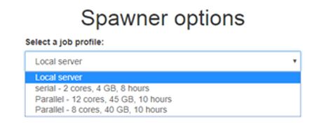
More job profiles might be available in the future as our resources expand. For example, GPU (Graphics Processing Unit) job profiles for data analytics/AI/deep learning.
Select “serial” for running non-parallel code, and “parallel” with the required computing resource for parallel code.
Launching Your Job
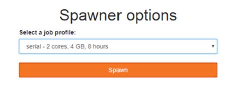
In the backend, Jupyterhub will submit a PBS (Public Broadcasting Service) job script to launch a Jupyter notebook session for you. Similar to submitting PBS job scripts in the command line/terminal, your Jupyter notebook session job may have to wait in queue.

The Jupyter Notebook
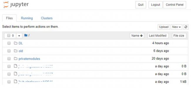
When the server starts up, users will be redirected to a standard Jupyter notebook environment with their home directory displayed. From this screen, you can create new Jupyter python notebooks and more.

Working with Jupyter Notebooks
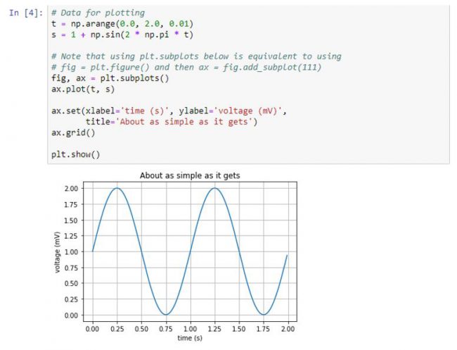
Besides plotting the usual plotting of graphs, Jupyter notebooks are useful for visualising neural networks.
Visualising a Simple Convolutional Neural Network (CNN)
Visualising a neural network can give us useful information about what it is learning. While designing a neural network for the task of image recognition, it is sometimes useful to be able to interpret and understand the model’s predictions.
Libraries used: Tensorflow, Keras, Numpy, matplotlib
We train a simple convolutional neural network (CNN) with the following architecture on the MNIST (Modified National Institute of Standards and Technology database) dataset. The network was trained for 10 epochs with a batch size of 256 with the Adam optimiser (Advanced Data Management).
• Input, size 28x28x1
• Convolution, 32 filters, kernel size 3×3, ReLU activation
• Convolution, 64 filters, kernel size 3×3, ReLU activation
• Max Pool, pool size 2×2
• Dropout 0.25
• Convolution, 128 filters, kernel_size 3×3, ReLU activation
• Max Pool, pool size 2×2
• Dropout 0.25
• Fully connected, 128 neurons, ReLU activation
• Dropout 0.5
• Fully connected, 10 neurons, Softmax activation
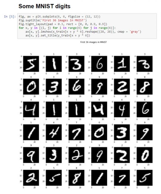

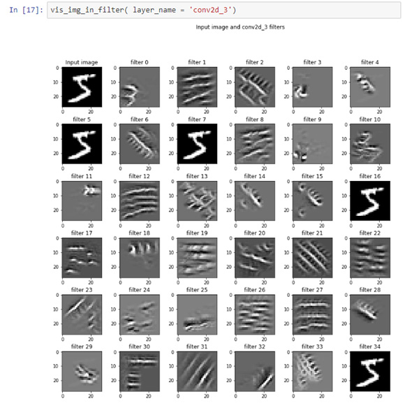
With the trained model, we can now visualise the weights of the layers, layer activations given an input, saliency maps and much more.
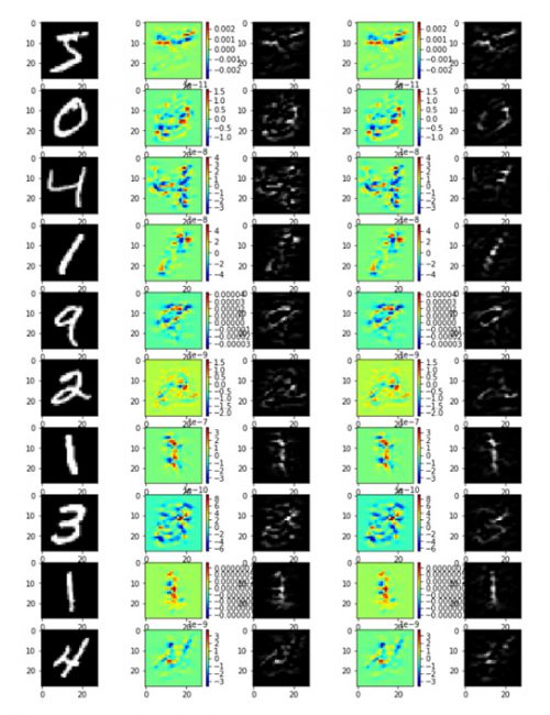
The goal of the saliency map is to identify the pixels of an image which contribute the most towards a particular class prediction. Basically, the most important pixels are those that makes the network determine that it belongs to a certain class. Saliency maps are useful for segmenting images, it can be used to localise the area of interest in the image.
As shown above, Jupyter notebooks can be used for more than just plotting graphs, it can be used for examining and understanding neural networks and many more analytical applications.
Users can look forward to more visual and interactive software for Data Analytics, Machine Learning and Deep Learning in the future.
Reference
- Project Jupyter: http://jupyter.org/
- More on Visualising Convolutional Neural Networks: Understanding CNN http://cs231n.github.io/understanding-cnn/
- Deep Inside Convolutional Networks: Visualising Image Classification Models and Saliency Maps https://arxiv.org/abs/1312.6034v2
Please contact the Data Engineering Technology team at DataEngineering@nus.edu.sg if you have any query on the above developments.
