Understand Your HPC Usage Profile
By Wang Junhong, Research Computing, NUS Information Technology
I. Introduction
In our continuous efforts in improving the user friendliness of HPC services, a customised email alerting function had been introduced to send an email for the summary of jobs completed in the last hour.
This gives the users an instant update of their HPC jobs progress. To further improve the user experience and to assist users in understanding how well their simulations are performing in the HPC system, an intuitive usage profiling for every user will be introduced to illustrate the usage profiling in four ways:
- Number of jobs completed at daily basis
- Overview of waiting time and running time of all jobs
- Overview of parallel speedup performance and efficiency of all jobs
- Overview of memory utilisation and efficiency of all jobs
The details of the four profiling data are given below.
II. Usage Profiling Details
1. Number of jobs completed
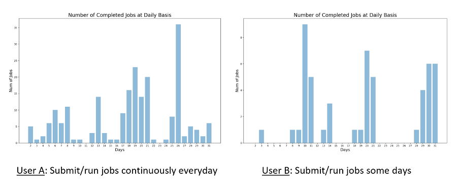
The number of completed job profiles is plotted versus each day of the month. This illustrates and refreshes the users on how many jobs they have submitted or ran in the past month on different days, so they will understand their usage pattern.
For example, from the plot in Fig. 1:
• User A: submits and runs jobs/simulations almost every day continuously.
• User B: submits and runs jobs/simulations on some days in the month.
 Fig. 1 Number of Completed Jobs
2. Waiting Time and Running Time of Jobs
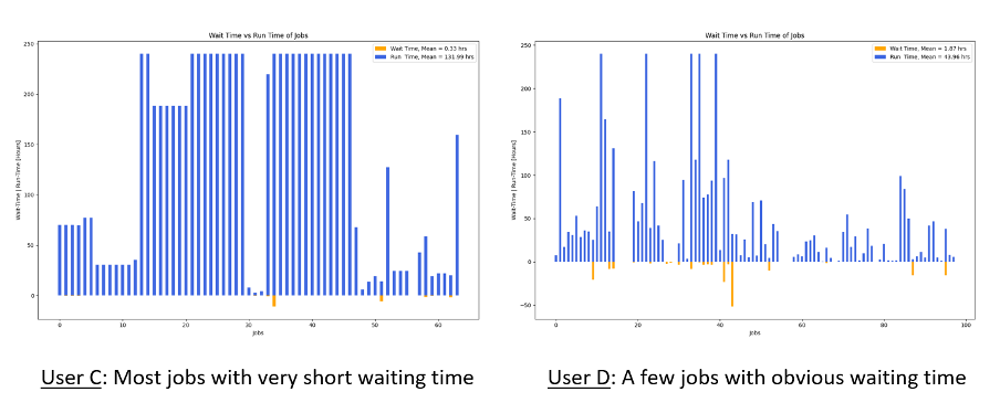
The overview of waiting time and running time of jobs gives the users a quick view on how long their jobs had to wait before running and how long their jobs had to run to complete. As illustrated in Fig. 2, the orange bars at the lower part of the graph represent the waiting time and the blue bars at the upper part represent the running time.
The waiting time and running time of jobs plotted in Fig. 2 shows that:
• User C: all jobs start running with very short waiting time (no orange bar below) except two jobs with obvious short waiting time (orange bar in the graph).
• User D: a few jobs with obvious waiting time (long orange bars in the graph) while most jobs start running with very short waiting time (no orange bar below).
Ideal scenarios to be observed in Fig. 2 for waiting time and running time of jobs include:
• Shorter orange bars or no visible orange bars: means very short waiting time or zero waiting time.
• Relative higher blue bars vs orange bars: means jobs spend more time in running on CPU(s) other than waiting in the queue (assume that all running time are used to do the actual computations).
 Fig. 2 Waiting time and running time of Jobs
3. Speedup Performance and Efficiency
Many users run simulations in a parallel manner on many CPU cores to speed up their computations and shorten the computing time. The speedup performance, or the speedup rate, and the efficiency illustrate how well the jobs can scale up and perform on large number of CPU cores.
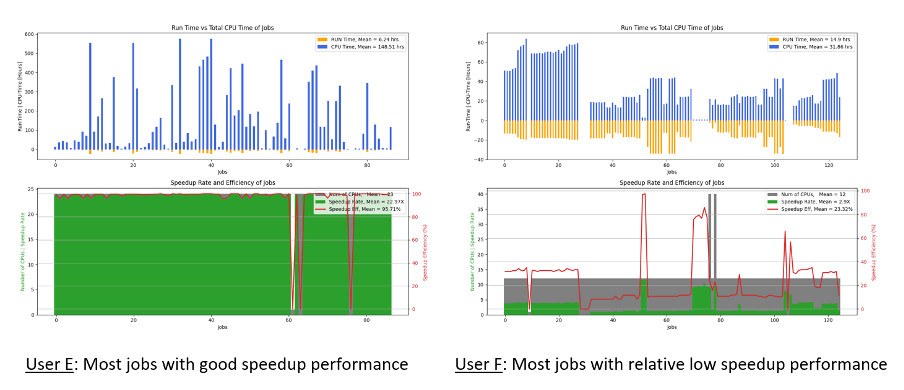
As illustrated in Fig. 3, the bar charts at the top illustrate the comparison of elapsed running time (orange bars) versus total CPU time (blue bars) of the jobs. Longer blue bars mean that jobs are running on many CPU cores simultaneously hence consuming more CPU hours. The filled-plot-line charts at the bottom illustrate the parallel performance in speedup rate and the efficiency of the jobs.
The speedup performance and efficiency plotted in Fig. 3 show that:
• User E: many jobs scale very well, within the relative shorter elapsed running time (orange bars) there are higher total CPU time (blue bars) generated. This reflects in the high speedup rates (bigger green zone) that are very close to the number of CPUs requested (grey zone). The parallel performance efficiency (red line) of most jobs is close to 100%.
• User F: many jobs do not scale well, with relative smaller differences between the total CPU time (blue bars) versus elapsed running time (orange bars). The speedup rate demonstrates that the parallel performance is about 3x out of 12 CPUs requested for the jobs. The parallel performance efficiency (red line) of most jobs is lower than 40%.
Based on parallel speedup performance and efficiency profile demonstrated for User F’s jobs, there is definitely room to improve. User F is advised to carry out further investigations and debugging of his/her code to achieve better parallel performance that will speed up his/her computations.
Ideal scenarios to be observed from Fig. 3 for speedup performance and efficiency are with:
• Higher blue bars versus shorter orange bars: means jobs can scale well when they are run on many CPU cores
• Larger green zones and smaller grey zones: means most of the CPU cores requested for the jobs are being used for job computations rather than idling. Large grey zones indicate more CPU cores are hogging and idling, which is a waste of CPU resources
• When the Red line is higher and nearer to 100%: it means ideal parallel performance
 Fig. 3 Speedup Performance and Efficiency
4. Memory Utilisation and Efficiency
In reality, many users do not know the actual memory usage of their program, so they will request as much memory as possible to ensure their program can run smoothly without being terminated due to memory limit. This may lead to exaggerative request of memory and therefore result in waste of memory resources.
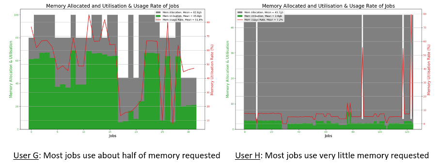
The memory utilisation and efficiency of jobs plotted in Fig. 4 tell that:
• User G: many jobs use about half of the requested memory and the average memory utilisation rate is about 50%.
• User H: most jobs use less than 10% of requested memory for the jobs, which implies that 90% of memory are hogged and cannot be allocated to other jobs.
In conclusion, both User G and User H should consider reducing the memory demand for their job submissions. This will avoid over demand of memory resources and help to improve the memory utilisation efficiently. This will also improve the job scheduling cycles where more jobs can be scheduled for running and there will be a shorter average waiting time for jobs, which will be a beneficial to all HPC users.
Ideal scenarios to be observed from Fig. 4 for memory utilisation and efficiency should be:
• Larger green zones versus smaller grey zones: means more memory resources are utilised to run the jobs rather than hogging and idling.
• The Red line is higher and nearer to 100%: means better memory utilisation.
 Fig. 4 Memory Utilisation and Efficiency
III. View My HPC Usage Profile
The HPC usage profile will be generated in image format at monthly basis for every HPC user. You can find and view the usage profile at \\hpcnas\svu\username\_myHPC_Usage_Profile\. Replace the username with your NUS account name. If you are out of campus network, please establish NUS VPN connection first.

